Chart

NOTE: This manual was written with oxygen readings from the ambient air, not in a valid run-time environment.
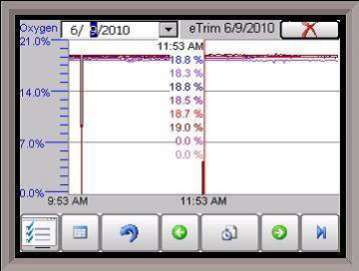
This will display a chart of the data points for the e-TRIM system. Currently, the data points that are logged are the Oxygen readings for up to sixteen burners. Each oxygen reading will be a separate line and color on the graph.
The red line on the graph will act as a cursor. Holding down the stylus on the red line and moving to the left or the right will modify the time on the bottom of the chart and update the oxygen values displayed.
The red “X” in the top right corner will close the Chart screen.
The date for display can be changed by clicking on the down arrow next to the date in the top left corner.
The beginning time for the display range will be listed in the bottom left corner of the chart. The middle of the display range will be listed in the center of the chart. The chart will always use the current system time as the starting point for the display range. If the range is 8 Hours, then the time in the left corner of the chart will be 8 hours ago, and the time in the middle of the chart will be 4 hours ago. If the range is 12 Hours, then the time in the left corner of the chart will be 12 hours ago, and the time in the middle of the chart will be 6 hours ago.
If the user holds the stylus or their finger down on the white area of the chart for three (3) seconds, a sub chart menu will be displayed.
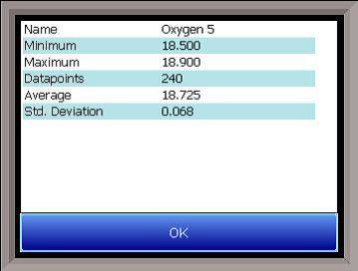
The button on the left -  - is the Trend Lines button. This button will allow the user to select which trend lines (data points) to display on the chart, as well as view statistics for each data point. Note – Removing a trend line from display does not stop logging the data for that point. If the checkbox is checked, that data point will be displayed on the chart. If the checkbox is unchecked, the data point will not be displayed. Clicking on the check box will toggle between checked and unchecked. The “fx” button will display the statistics for the selected data point. The statistics that are displayed are: the name of the data point, the minimum value for the date/time range, the maximum value for the date/time range, the number of data points in the date/time range, the average value for the date/time range, and the standard deviation for the date/time range.

The OK button will save any changes made and close down the Trend Lines screen. The Cancel button will simply close down the Trend Lines screen and not save any changes that have been made.
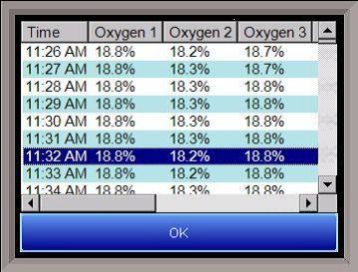
 - is the datagrid button. This will display all of the data points for the trend lines in a column format. The date/time range for the display will be the same as the date/time range for the chart.

 - is the undo button. This will undo any zooming on the chart and return it to the original aspect.
 - will move the chart display back in the past by half of the display range. For example, if the display range is 12 Hours, then clicking on this button will display six more previous hours.
 - will allow the user to change the display time range for the chart. The options are:
1 hour
2 hours
4 hours
8 hours
12 hours
24 hours
 - will move the chart display forward in the future (up to the current time) by half of the display range. For example, if the display range is 12 Hours, then clicking on this button will display the next six hours.
 - will put the chart into real-time mode. When in realtime mode, the chart cursor (red line) will move to the far right of the chart and display those values. Once a minute, these values will be updated as the time refreshes.