SDS à View Real-time Data

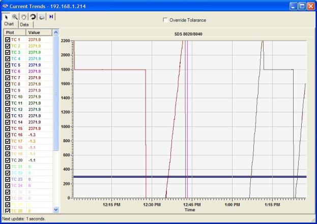
Figure 2.40 Real-time Data screen
The View Real-time Data menu option will display the most current real-time data available. This screen will update itself with the most current real-time data every 60 seconds. The amount of time left until the next update will be displayed in the bottom left-hand corner of the screen. When it does update, the software will connect to the SDS, download the data, and re-draw the screen. Any screen settings, such as the size of the graph and how zoomed in the user is, will not be changed. Note: if the Multiple SDS Mode menu option is checked, then the SDS software will display a device selection box that will allow the user to choose which device to gather the real-time data from (figure 2.37). If the Multiple SDS Mode menu option is not checked, then the SDS software will gather real-time data from the first SDS device that it finds on the network. Note: it is possible to view real-time data from more than one SDS instrument at a time. To view multiple real-time data, click on the View Real-time data menu option again and select the next SDS instrument. The Chart tab will display the real-time data as a graph, along with the tolerance, displayed as 2 blue lines. The Data tab will display the real-time data in numerical form. On the Chart tab, all of the buttons are available. On the Data tab, only the Print button is available.
 Cursor Button
This is the default cursor used on the screen. The user can select the various TCs to plot and move the scrollbar on the left side of the screen up or down in order to see more TCs.
 Zoom Button
This will allow the user to zoom in the graph of the real-time data. Once the cursor is over the graph it will change to a crosshair, Æ. The user can then hold down the left mouse button and drag the cursor to highlight the section of the graph that is to be enlarged. Letting go of the mouse button will enlarge the graph.
 Pan Button
This will allow the user to pan to a different part of the graph. Once the cursor is over the graph, it will change to a crosshair with arrows, . By holding down the left mouse button and moving the mouse left, right, up, or down, the user can move the scale of the graph by minutes or temperature, or both.
 Refresh Button
This will refresh the graph and reset the graph’s display values to their default values. For the values along the y-axis, the refresh sets the range from 0 to 2400. For the minutes along the x-axis, the refresh encompasses approximately two hours. Note: when the Real-time screen first loads up, the graph encompasses roughly one hour of data. The graph is marked with fifteen-minute intervals along the x-axis.
 Print Button
This will create a print preview of the graph for printing purposes. When the user clicks on the Print button, the Print Preview screen will be displayed (figure 2.41).

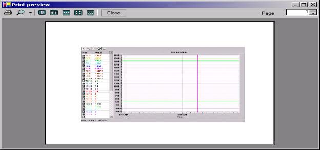
Figure 2.41 Print Preview screen
From the Print Preview screen, the user can choose to zoom in on the preview by pre-defined percentages (10% - 500%) or leave the zoom on the default setting (auto). The user can also determine how many pages to view at once (one, two, three, four or six). The default is one page. The upper right-hand corner of the Print Preview screen contains a page counter, which will allow the user to select which page to preview. Clicking on the “Close” button will close the Print Preview screen without printing the chart. Clicking on the Print button ( ) will print the document. Note: the Zoom function is for preview purposes only and will not affect the actual print size. Once the document has been printed, the user can close the Print Preview screen.
 Real-time button
This button will allow the user to keep the cursor in a real-time mode, which will automatically update the TC values on the left of the screen after every update. Clicking on this button will start the real-time mode. Clicking on this button a second time will take the screen out of real-time mode. Note - The graph will still continue to update once a minute, but the values on the left will no longer be up-to-the-minute accurate.
The checkboxes under the “Plot” section will allow the user to determine which TCs to plot on the graph. Checking a specific TC will display that TC’s data on the graph. The data under the “Value” section is the current temperature of the TC. Note: even if the Pan button or the Zoom button has been selected, the user can still select or de-select the TCs. This will not affect the zoom status or the pan status.
The “Override Tolerance” checkbox will allow the user to override the tolerance that is set up for the report. Note – This does not change the actual tolerance on the survey report, only on the real-time screen. Once checked, the user will be able to select a setpoint and a new tolerance. The tolerance bars on the graph will also update with these changes.
